Relias Rebrand
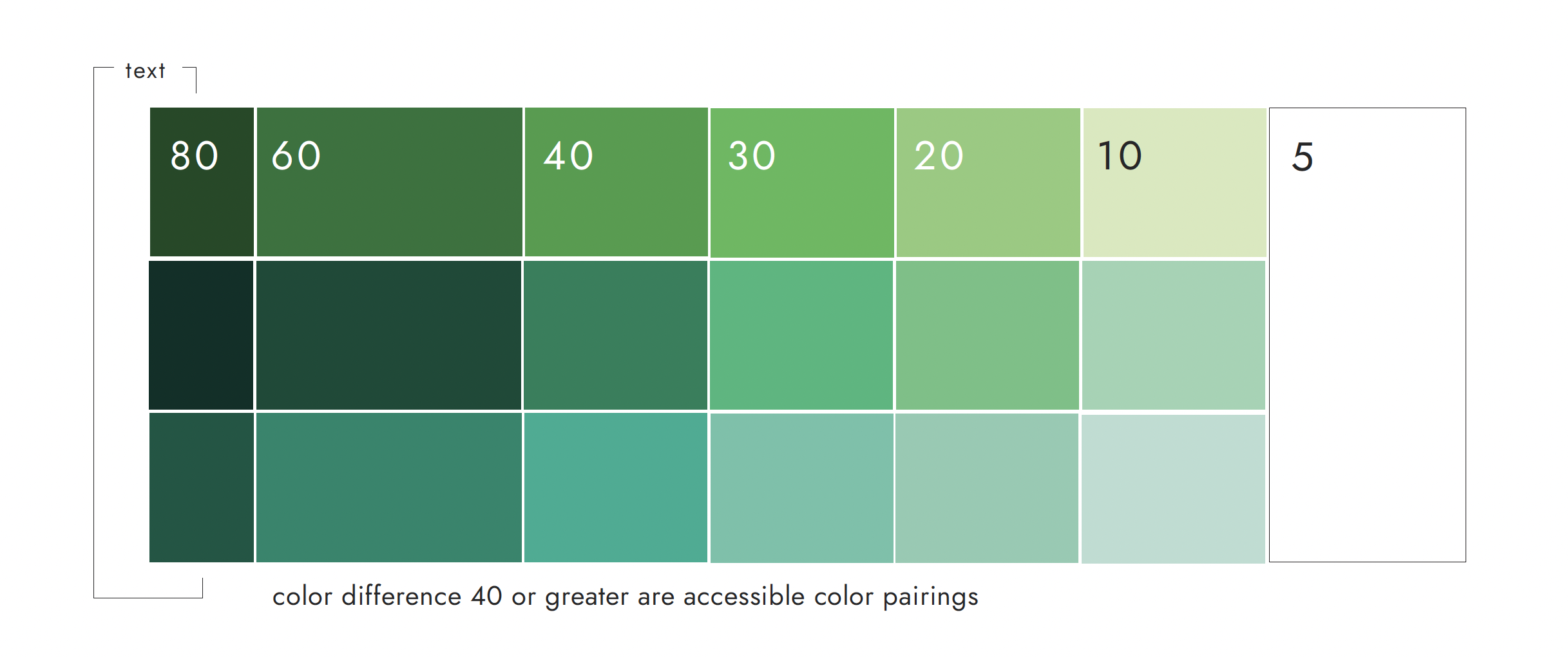
Updated color palette with cohesive tones that work to complement and build upon one another.
Developed a numbering system for the colors that correlates with their accessibility pairings.
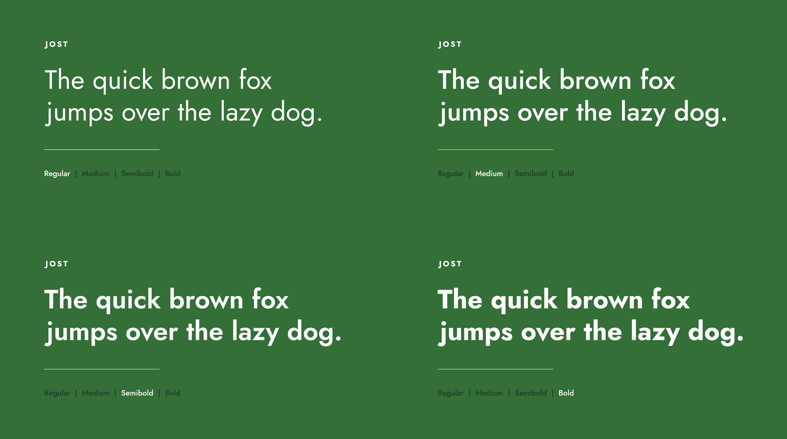
New corporate typefaces chosen based on their digital origins.
Layout style parameters were developed to provide consistency.
PowerPoint, Word, letterhead, business card, and email signature templates were created to encourage self-service and timely company production needs
Data visualization styles were accompanied by an accessibility pattern library
After acquiring 21 brands and experiencing much company growth, Relias embarked on a comprehensive rebrand. They were embracing a shift from being historically an online learning company to stepping into the space of a healthcare technology and SaaS company with a library of products and services.
I was responsible for the creative direction, strategy, and execution of the rebrand which required collaboration with many stakeholders and constant cross-departmental work.
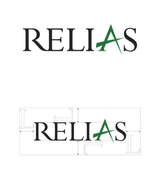
Together with my team we established new sub-brand logos (consolidating 21 brands down to 1 parent brand and 5 sub-brands), digital-first typography, layout standards, additive color methodology, illustration, pattern, icon, and image libraries, corporate Word and PowerPoint templates, accessibility and inclusive design standards, video and data visualization standards, product visual standards, and online brand guide.
Below is a sampling of this project.
Roles
Creative Direction and Strategy: Elizabeth Curl
Design: Pa’yton Silver, Myke Williams, Melissa Young, Elizabeth Curl, and Kara McClurg
Video/Animation: Pa’yton Silver and Myke Williams
New, cohesive sub-brand logo designs derived from parent logo
Rebrand application on digital ads, email banners, fact sheets, podcast art, reports, and etc.
Illustration style added a visual layer to stock imagery and pattern use.
Illustrations were a nod to the work our healthcare clients do daily and honoring that as art.
More than 70 custom icons were provided at launch to aid with presentations, collateral, and digital way finding.
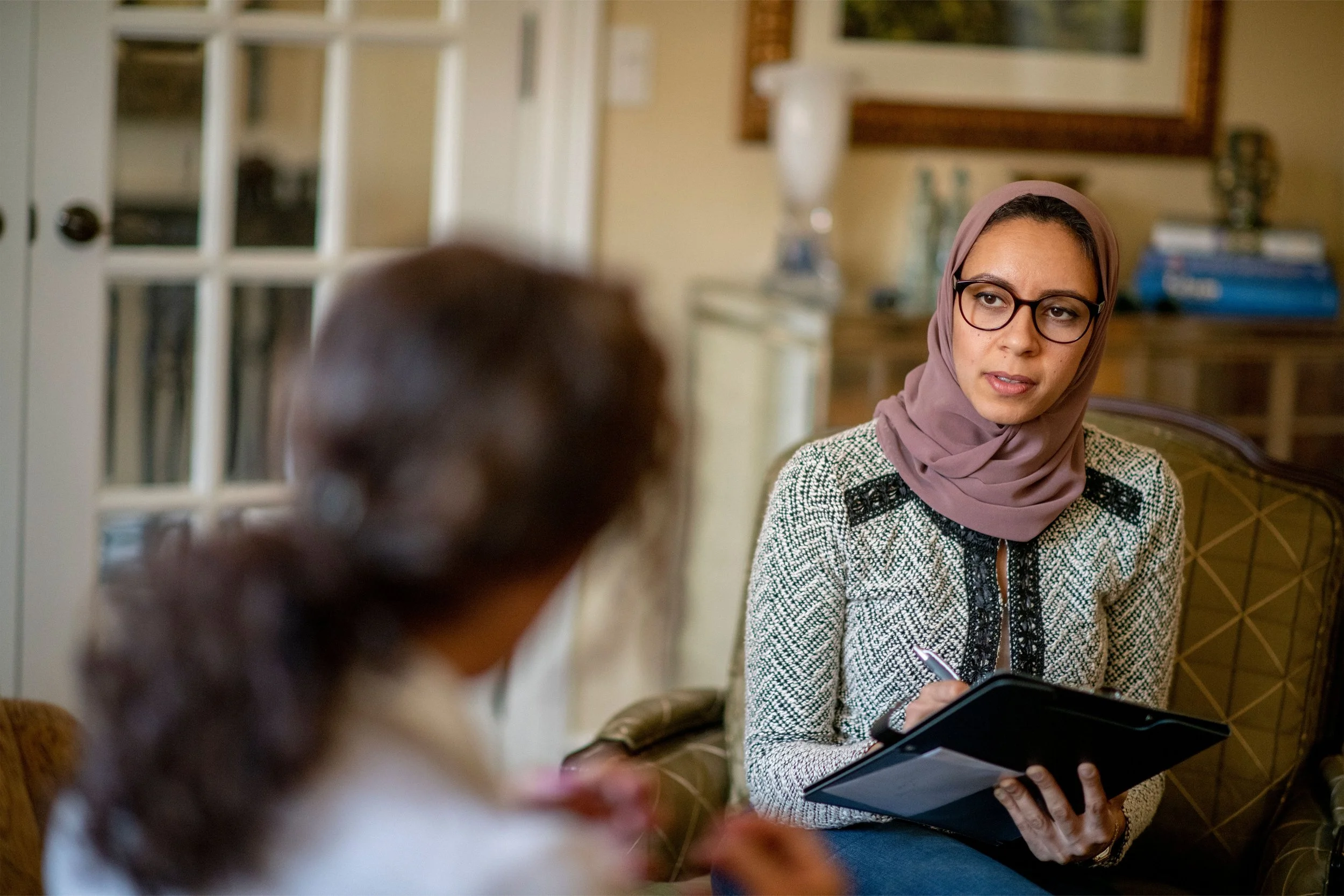
A curated photography library was provided companywide.
We developed light and composition parameters to keep images on brand.
We also used Adobe Firefly and Gen AI tools to keep the images accurate to the healthcare sector and speciality.
Lower thirds, transitions, and animation styles all established to support visual brand consistency
Custom patterns were drawn
in-house inspired by biomimicry. The theme of nature inspiring technology served as a nod to our healthcare technology mission.


