Color Methodolgy
When tasked with updating the color palette for Relias I had many ‘must haves’ to consider. Green was an established color of Relias and I could not deviate from that color family too far. We also inherited many additional colors by way of acquired brands. Our old palette had become disjointed and a pain point for our users as they navigated between our platform, products, and websites.
To begin I worked with our Principal UX Designer to fully grasp the user journey and various entry points into our products. Knowing how users interacted with our many product offerings and brand family helped inform my color decisions.
I began with a foundational palette that would be present regardless of the brand or product. A foundational gray was also paired with the foundational green to serve as the "neutrals.”
From there, secondary palettes that correlated to areas of the business were assigned.
Tests were done to explore application on illustration and pattern.
Areas of the business that needed delineation were identified and assigned a color family.
Appropriate color pairings were built to represent areas of business.
This process allowed for identification of brand and business need as well as cohesive tie in back to the parent brand.
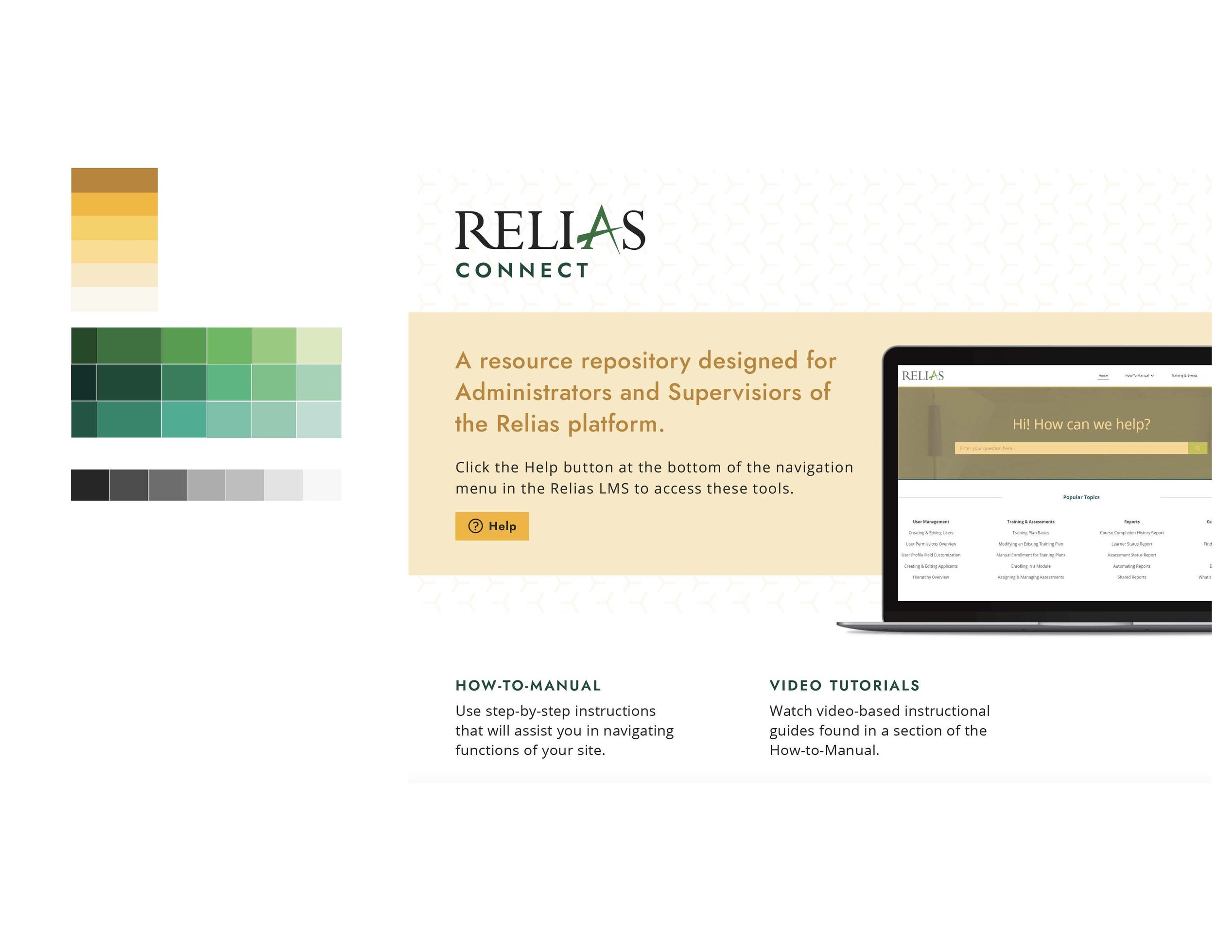
Many application tests were done to examine the new color approach.
More application tests.
Accessibility and usage rules were established. A numbering system for the numbers aided in companywide accessibility and WCAG compliance.
Tests on light and dark mode allowed for UX and Engineering teams to look into future mode offerings within our products.
Application examples were used to gain stakeholder buy in and ultimately launch this new approach as part of our company rebrand.


